Have you ever wondered how food bloggers make money? Well, you’re not alone!
We are going to breakdown the best monetization strategy to focus on for creating an income from your food blog.
Both ads and products are useful when you’re trying to create an income from your food blog, but you need to make sure that you’re not using both at the same time.
That last part is important: make sure that you’re not using both at the same time.
Ads vs. Products
The question doesn’t necessarily need to be “Which is better, ads or products?”, but “Which is better in a given situation?” In order to know the answer to that question, we need to know the purpose of ads and the purpose of products.
The Purpose of Ads
The purpose of an advertisement on your website is to divert someone’s attention away from your blog and towards the company that is advertising on your blog.
The ultimate goal for the advertiser is to get a visitor to click on an ad and leave your site. You (the blogger) will be paid more if your blog readers leave your site and go to the site that is being advertised.
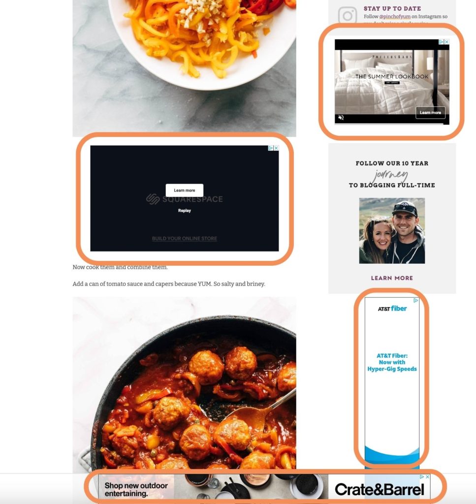
You can see what different examples of ads look like on our sister site, Pinch of Yum, here:
The Purpose of Products
The purpose of selling a product on your blog, whether it’s your own or an affiliate product, is to capture the readers’ attention and communicate why the product would be a good investment.
You (the blogger) will be paid more if your blog readers stay focused on the content that you’ve written and eventually decide to purchase the product.
Shopping at Target for a Pug Shirt
Let’s cut to the chase: You should only use ads on posts or pages that don’t promote your own products.
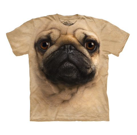
This concept is easiest to understand if we use a brick and mortar example, so let’s imagine you are going to buy a new (pug) t-shirt at Target.
You go to Target and head to the back of the store. You find the clothing section, but when you turn down the aisle you notice a group of people huddled around the t-shirt rack.
After you get a little bit closer you realize the group of people are sales reps from Tide, Folgers, and Gap.
As you browse through the different t-shirts the sales reps start to chat with you about their products.
“Did you know that Tide PODS are on sale today?”
“Folgers has a brand new flavor you should check out!”
“Don’t forget that Gap’s spring sale starts tomorrow!”
You’re a bit annoyed, but you remember that you’re actually running low on Tide PODS. You take out your phone and add “Tide PODS” to your grocery list. Once you have your phone out you see that you have a message from your best friend and you decide to call her back.
You completely forget about the t-shirt and continue on your way.
The same exact thing happens millions of times a day (an hour?) on blogs across the world.
People that are interested in making a purchase come to a page, start to read or engage with the content, get distracted by something not related to the product, and then end up leaving the page without making a purchase.
Sometimes there’s nothing you can do about it, but oftentimes there is.
The best thing you can do in these situations is to make it easier for your readers to focus. We’ll talk more about this in a bit, but it’s also important to understand when we should use ads.
When Should I Use Ads?
Ads are a good fit whenever you don’t have a specific offering already on that page.
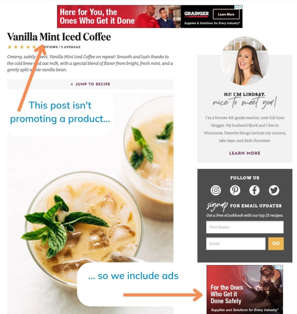
An obvious example is a recipe post. Usually when a food blogger publishers a recipe post it’s not accompanied by an offer for a certain product. It’s a recipe that’s meant to be shared, but there’s no strong call-to-action associated with the post.
In a situation like this, advertising would be a good fit. While the ads are still distracting, they’re not distracting the reader away from something they might purchase from you.
Creating a Focused Page for a Product
Now we know that on pages where we promote a product or have a call-to-action, it is best to avoid distractions (like ads). But what exactly should these ad-less pages look like?
Want to learn more about creating a product for your blog?Here are some suggestions:
1. Remove the sidebar
If you’re going to focus on promoting a product then you should eliminate the distracting elements. One of the most distracting elements on a blog is the sidebar.
Many blogs have ads in the sidebar, but there are also lots of other distracting elements like social media buttons, email sign ups, and “about me” sections.
Original post, with sidebar:
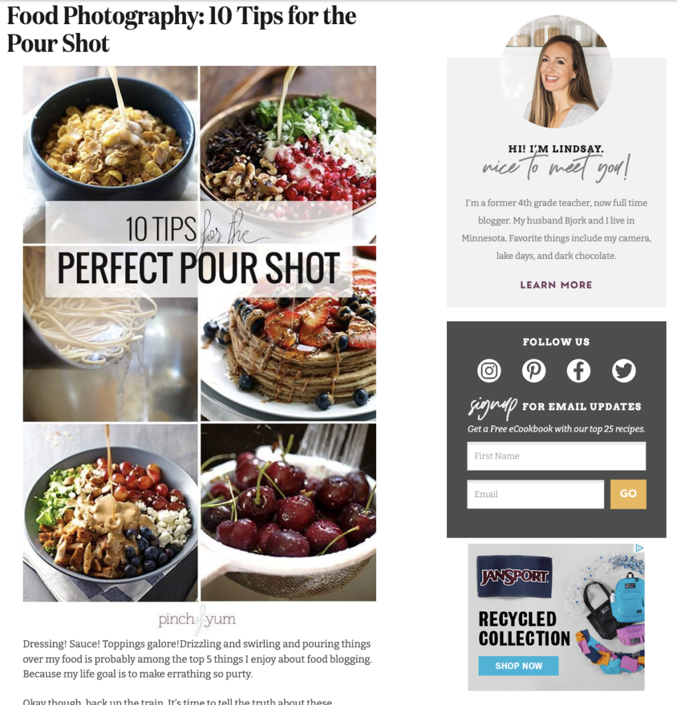
Removing the sidebar will make it much easier to focus on the primary content.
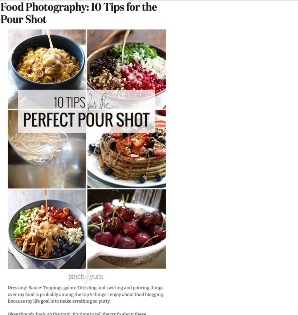
2. Center the content
If you remove your blog’s sidebar then you’ll quickly notice that the design of the site might seem a bit off balance. Centering the content will make the page feel more balanced and intentional.
3. Create an obvious call-to-action
A simple text link isn’t enough.
If your goal is to encourage people to purchase a certain product then you need to make sure they know how to purchase it.
Make sure to include a button or image that makes it obvious to people where they should click to purchase the product.
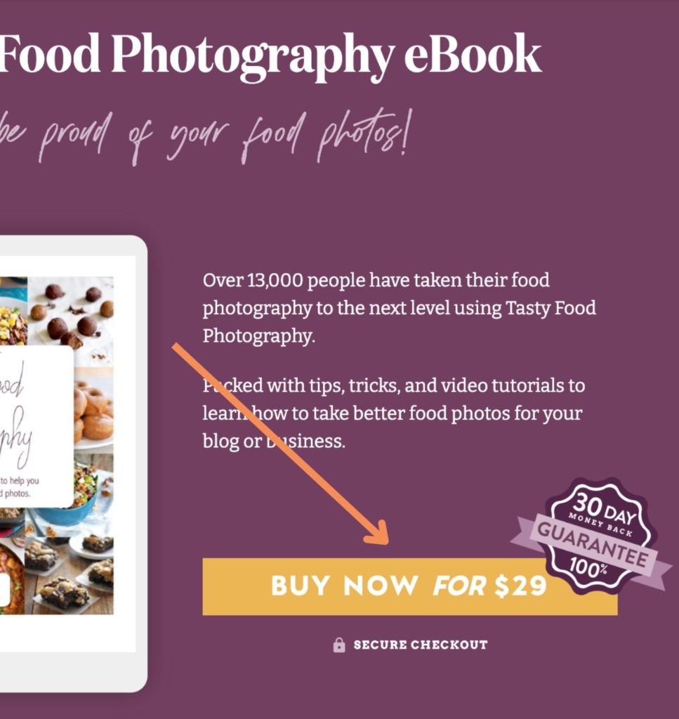
Bonus: Studies show that web users spend the majority of their time looking at information above the fold, so bonus points if you can find a way to (authentically) include a call-to-action above the fold.
The Bottom Line
Promoting products and using ads are both effective ways that food bloggers make money, but the effectiveness decreases when you use them both at the same time.
Do you have an example from your blog? Leave a comment with a link to a product page (that doesn’t include ads) from your blog or another website. The comments will be a great resource for other bloggers that want check out some examples.
Hi Bjork, great post as usual. Since I would be happy to make your day, here is a post promoting products (affiliate links) with no ads. http://www.thegardenofeatin…
Awesome! Thanks Eve.
This is great to hear… I don’t have my own products on Dish by Dish yet… but i’ll keep it in mind in the future!
I always put myself in the place of the reader, because mostly that’s what I am. I understand that having ads on your site is a necessity if you want to draw an income. However, there needs to be a line drawn somewhere on the number of ads that are there. I have literally stopped visiting several blogs because the ads were so overwhelming. Aside from it being super annoying, it really can slow the site down. Sorry for the rant, it’s just a hot button for me, and I don’t know how to find the happy medium I guess.
Similar to Lauren, before I create my own product, I thought it would be useful to have a resource page (http://kipkitchen.com/resou… ) readers can refer to. I’ve included kitchenware I use which makes life easier in the kitchen.
Great advice. Here’s my product page that doesn’t have ads.
Thanks Laura. I heart planners too!
I just created a new ‘Healthify Your Kitchen’ page for people just getting into healthy living. It shows them exactly what I’d recommend having in their kitchen & why — takes out all the research! It’s a good way to utilize affiliate links if you don’t have your own product.
http://www.laurenliveshealt…
I’m working on an e-book next, but am a little in-over-my-head with that one!
Thanks for sharing Lauren!
Love your posts like always! So much great information. We sell memberships on our site and so we want our customers to stay on our site as long as possible and not leave. So, we forgo the income from ads, and just get paid from the membership fees. People seem to appreciate a clean look without any ads 😉 Thanks again for the great tips!
Hi Bjork, I loved this article! You always give such practical advice.
Here is an article of mine with no ads: http://orgali.ca/2015/04/my….
I’ve noticed on Minimalist Baker that they don’t necessarily remove the sidebar on their blogging related posts but they specifically tailor the sidebar to match the content. I’m thinking they do this with the Genesis Simple Sidebars plugin or something similar. But then on their product pages they use a full width display.
Abby and I have three products with dedicated landing page. The first one was created almost a year ago so we’re getting better!
http://justagirlandherblog…
http://justagirlandherblog…
http://justagirlandherblog…
In addition to ads, we removed header and footer content as well. Thanks for another great post Bjork!
I totally agree with you on this post. If you’re selling a product you don’t want to distract the reader or send them somewhere else. I put a lot of work into my 30 Minutes to Healthy Eating Cookbook and Meal Planner ebook. For the sales page I created a custom page layout that was full width and removed the sidebar, footer, even comments. Basically any unessesary content I could. Both of your sites and posts have been great help and inspiration. Thanks!
You can see it here (on desktop it’s easier to notice the difference between this page and my recipe posts) http://www.platingpixels.co…
Excellent information as always. Funny, I removed the sidebar not because of the distracting ads but because I wanted wider real estate in the body of the post for the products. LOL. Here’s my page. I welcome any thoughts or suggestions to improve it.
Great thoughts Bjork, as always! Here’s a link to my product page with no ads!
Good points as always Bjork.
I tried removing the sidebar for my signup page, but it seems that the Foodie theme, which so many of us use, would not allow this change in page setup (unless there is something else interfering with this option):
http://www.ThePrimalDesire.com/sub…
But I did remove the ads from that page, so thanks for that recommendation!
Great point, one that I must’ve heard from you or someone else at some point in time because that’s exactly how I laid out my sales page for an ebook I published: http://www.briana-thomas.co…
Great advice as always!!. Thank you much. Blessings!.
http://www.valentinascorner…
This was a really useful post Bjork! I’ve removed the sidebar from my most popular tutorial post (http://amyshealthybaking.co…, but I haven’t figured out how to center the content. Do you and Lindsay have a tutorial for how to do that? I’m running a customized Genesis theme and would love to hear any advice you have!
Great question! This won’t work with every theme, but we wrap the HTML content in a centering div.
<div style=”max-width:600px; margin:0 auto;”>HTML HERE</div>
Thanks for the info! It’s always great to be reminded of all the ways you can help monetize all the hard work you’ve done. Here’s a link to my page where I sell my Overnight Oats Jars:http://www.veggiesdontbite…
I set it all up and here is my much cleaner looking page: http://itdoesnttastelikechi…
Thanks Bjork!
I’m not a food blogger, but this is exactly what I tell my clients (who are usually makers, selling finished products)! You can find an example of my sidebar-free sales page (for a program that’s not currently open) here: https://taraswiger.com/lift-off-is-closed-for-now/
I sure enjoy your emails Bjork. I waded into this world, knowing nothing, and I sure appreciate getting information from those who have gone before! I am not selling anything just yet, but that could change! http://www.cpjanes.com
I love this post! I haven’t put too much thought into how advertising and a side bar can take away from a product page, but it makes so much sense! Here’s my product page without a side bar or advertising. The page needs a bit of work, but hoping to have a custom site built soon! http://fitgevitysolutions.c…
Always helpful articles..
Such a helpful post!
This post really helped me design my e-cookbook landing page – I use the Foodie theme but the landing page was customized by Sara from Moonsteam Design, and I removed all ads except one at the bottom, centralized the column (70% width), and have a pretty long sales story. For those interested, here’s the page: http://dishbydish.net/simpl…
Felicia, your blog is gorgeous and your sales page makes me want to cry. 😉 Very nice job!
Awww, thank you so much Beth. 🙂 I tried being as real as possible in my story, so people could understand why I wrote the ecookbook. Glad it touched you!
only thing I haven’t done is add “buy now button” I stopped doing this… I get traffic on reviews but no clicks… it’s sooo strange. I just heard of AB split testing, this was the answer I was looking for, but I wasn’t looking for it haha
Thanks mate!
Luuuuurve your epic advice Bjork ! Here’s my page (no sidebar) where I sell our Amish made wooden wheels for sliding door hardware with a super cool ebook explaining the whole shebang. It’s pretty amazeballs. 🙂 The ebook, I mean… not my page. ha!
Lynne from Design The Life You Want To Live
Thanks for sharing this article with us. Here is a link to our ebook page (ad free). It contains both a free ebook and the premium one.
http://delightfulvegans.com…
As always, great info. No ads: https://theprimaldesire.com…
https://uploads.disquscdn.c…
Great post, great info! Here’s our ebook page.
Hey blogger community! Karyn here with Dinner In Provence. So, I made a strategic (and tough) decision to not include ads on my site because I find them a little out of control on lots of other blogs when I’m just trying to read about a recipe. I ended up implementing (first) a small Amazon Affiliates storefront using WooCommerce. You can view it at the following link. The user journey is Shops > Product Wall > Product Detail > Add to Amazon Cart. It looks a lot more professional than Amazons own plugins and widget code. You guys can ping me if you want some tips on how to implement Affiliates with WooCommerce.
https://www.dinnerinprovenc…
Thank you for writing such a great and timely post. I, too, get annoyed by ads. I feel I have too many on my site. I am currently working on a product to sell on my site.
Hi Bjork, I love this article and checked out all the examples in the comments!
I just started my blog and there is a loooong way to go before I will start with ads. This week I gave it a try with a blog post with affiliate links; https://twopassportsonejourney.com/10-tools-to-have-the-best-vegan-bbq-ever/
Way to go, Linda! 🎉