Three months ago I wrote a post called How to Increase Your Conversion Rates with A/B Testing. In the post I promised to put together quarterly updates to let everyone know how the A/B testing is going.
My hope with these quarterly updates is to:
- Encourage you to do A/B testing if you have the time and energy.
- If you don’t have the time and energy then I want to show you the changes we made to help increase conversion rates.
You can take the things we’ve learned about increasing conversions and apply them to your sales pages without having to do any A/B testing on your own (but I still think you should do A/B testing if you have the time).
Results from the A/B Test
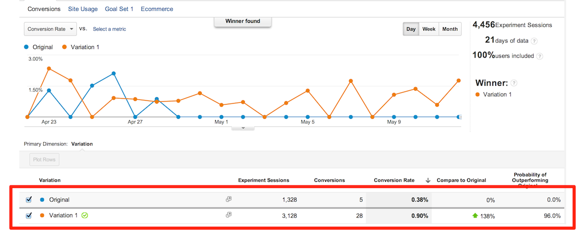
Let’s take a look at the results of the experiment (you can click on the image to see a larger version).
Conversion Rate, Compare to Original, and Probability of Outperforming Original
There are lots of data points that we can examine when using Google Analytics and Google Experiments, but in this post we’re going to focus on Conversion Rate, Compare to Original, and Probability of Outperforming Original.
Conversion Rate
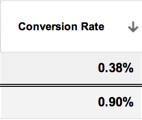 Conversion Rate shows us the percentage of people that decided to sign up for Food Blogger Pro after visiting the home page.
- The original page had 5 out of 1,328 people sign up. This resulted in a .38% conversion rate.
- The variation page had 28 out of 3,128 people sign up. This resulted in a .90% conversion rate.
Here’s a question some of you might be asking: Why did the original page only have 1,328 experiment sessions when the variation page had 3,128 experiment sessions?
That’s a great question. Thanks for asking. 🙂
Once Google Experiments sees a trend with the A/B test it will automatically start sending the majority of the traffic to the higher converting page.
This type of A/B testing is called a multi-armed bandit experiment. If you’re a data nerd you can read this article. It explains what a multi-armed bandit experiment is and why they call it that.
If you’re not a data nerd you can whisper “multi-armed bandit” out loud and then laugh at how funny it sounds.
In our case, Google Experiments noticed pretty soon that the variation page was converting better than the original, so it shifted the majority of the traffic to the variation page instead of the original.
Compare to Original
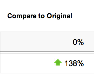 The Compare to Original number tells us how much better (or worse) the variation page is performing when compared to the original page.
Based on the data from this experiment we can expect to have 138% more sign ups for Food Blogger Pro with the variation page versus the original page.
To use real numbers, if the original page were to get 100 sign ups in a month than the variation page would get 238 sign ups in a month.
Probability of Outperforming Original
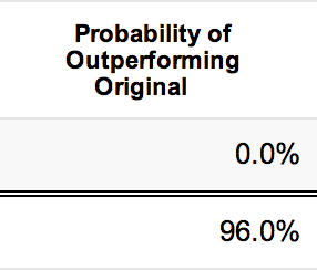 This number is kind of like Google Experiments saying “I’m this sure that the variation will do better than the original.”
The highest it can go is 100%. That’s Google Experiments saying that it’s really likely that the variation will outperform the original.
The lowest it can go is 0%. That’s Google Experiments saying there is no chance that the variation will outperform the original.

What’s different about the new Food Blogger Pro home page?
Video Background
One of the biggest changes that you’ll notice is the video background. This is a web design style that’s become popular because it can communicate in ways that static images cannot.
The first time I noticed a site using this type of design was in February when I went to login to PayPal.
I even tweeted about it (a rare occasion for me).

I wanted to test a similar design style for Food Blogger Pro but I knew the design and development would be pretty expensive. I did a little research and found a $12 theme on ThemeForest that was exactly what I was looking for. It’s called the Kane Theme. It’s probably the best money I’ve spent all year.
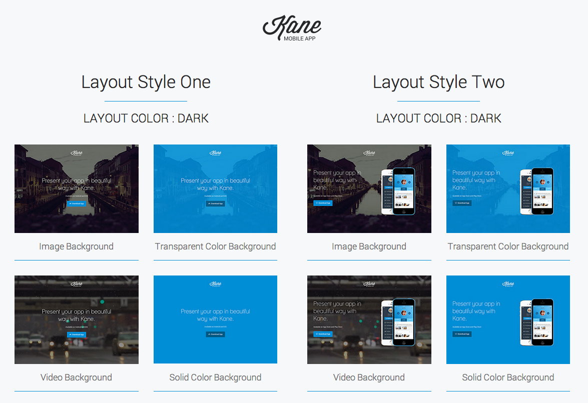
Here’s the reality with the video background though:
I don’t think the video stuff is the reason why this page converted better than the original. It’s actually possible that the video has a negative impact on the conversion rate (because it takes so long to load the page). It’s impossible to know for sure without testing, but I wouldn’t be surprised.
It’s much more likely that the following elements are what positively impacted the conversion rate.
1. Focused Attention Ratio
Attention Ratio is the ratio of interactive elements (links) to the number of campaign conversion goals (which is always one).
The attention ratio on the original page was 1:11.
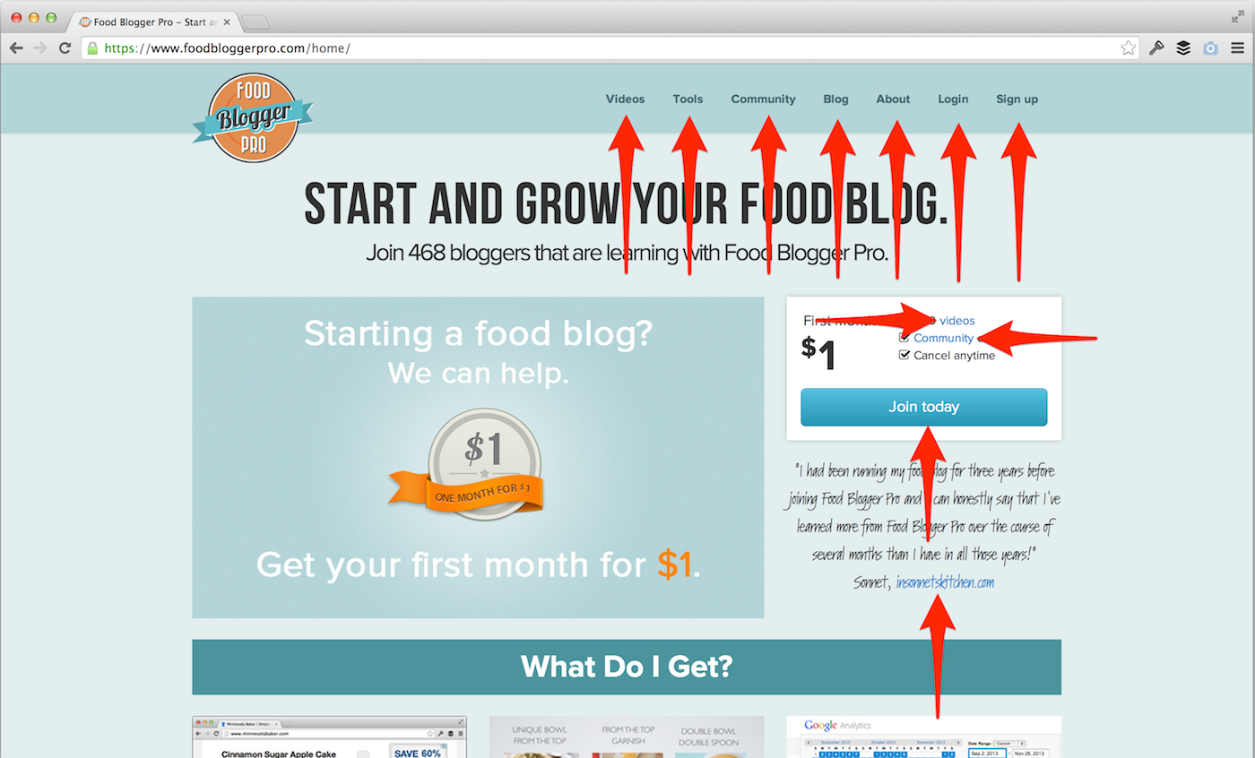
The attention ratio on the variation page was 1:2.
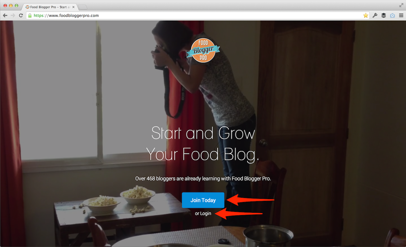
Ahhhhh. Much better.
2. Answers to common questions
Before the new home page I’d consistently get emails from people that said they were thinking about signing up for Food Blogger Pro but didn’t because they had a question about how the membership worked.
These were people that were ready to take the leap, but they had a little sliver of doubt that kept them from signing up.
The common questions section on the new page alleviates that doubt by providing clear and concise answers to the questions that people have before signing up.
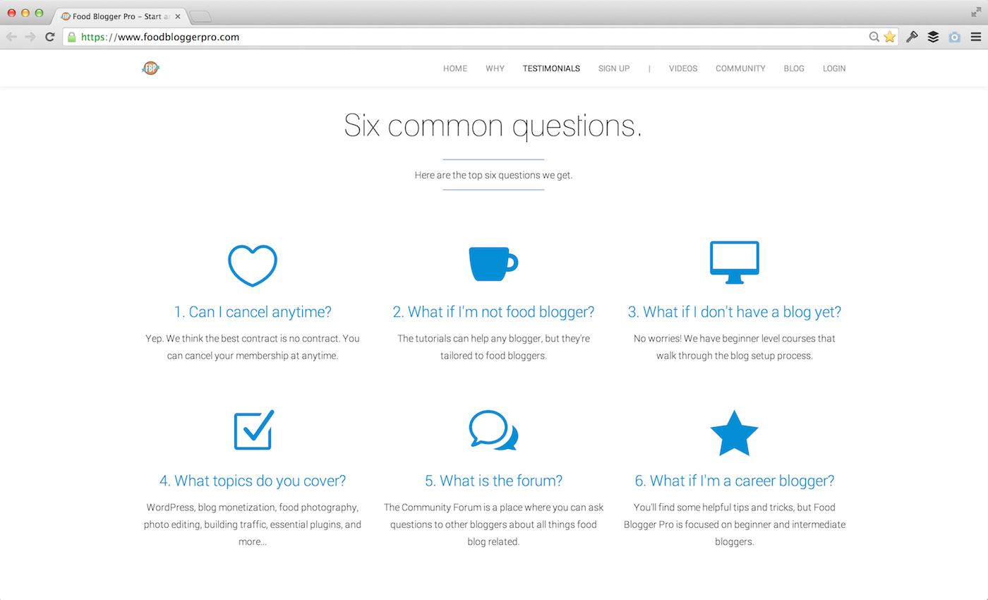
Any guesses as to what the most common question is?
Yep. You guessed it (or maybe you didn’t)…
Can I cancel anytime?
I don’t know about you, but I’ve definitely been burned by crummy contracts in the past (I’m looking at you, Comcast), and I’m guessing that lots of other people have as well.
That’s why we wanted to clearly communicate on the new home page that you can cancel anytime, no questions asked. Not only does this reduce the number of emails I need to answer, but it also helps to increase the conversion rate.
3. Proximity of testimonials to call to action
Can I take a moment to acknowledge how boring that sounds?
Ahk. Sorry about that.
It’s an important concept to understand despite how boring it sounds.
Here’s a personal story that explains why this is important:
About once a week I experience what I call “think and hover.” Do you know what I’m talking about it? It’s that moment of truth when you’re trying to decide whether or not to buy something. You hover over the buy button while thinking about whether you should click on the button or click the back arrow in your browser.
I experienced this phenomenon most recently when considering whether to sign up for a product called LeadPages. It was priced at $67. Super expensive for a recurring monthly fee, so it wasn’t an easy decision for me.
I had slowly made my way through the sign up process until I got to the dreaded billing info area.
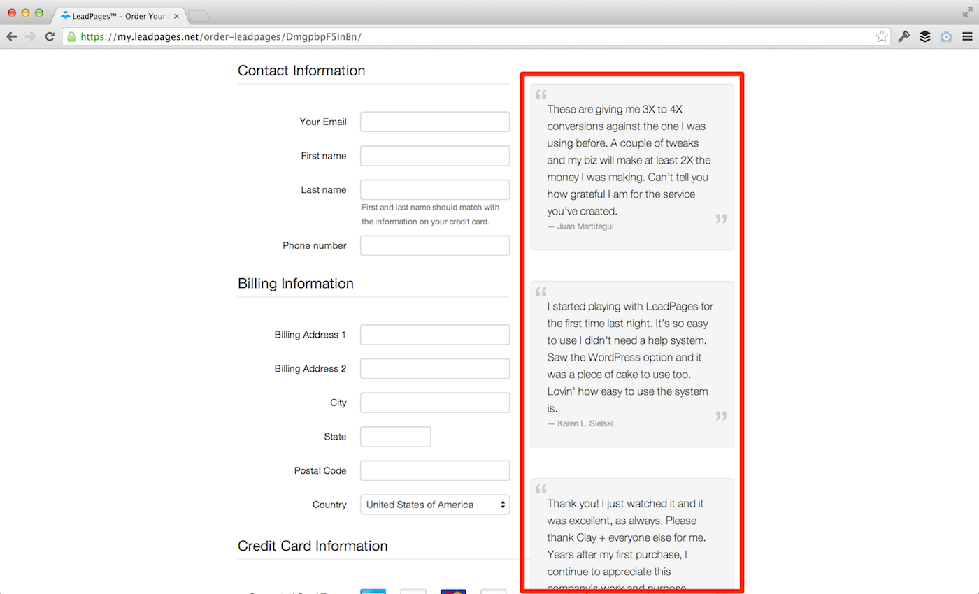
Do you see what they’re doing that’s really smart? I gave you a hint with the red box. 🙂
They’re placing testimonials right next to the billing info area.
It’s a great way to encourage people to continue to go through with the sign up process, reassuring them that they’re indeed making a good decision.
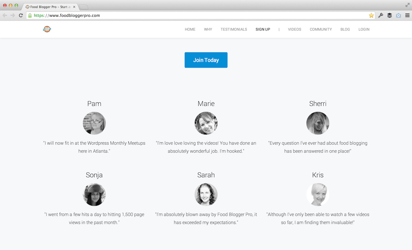
We applied this concept to the FBP home page:
As well as the sign up page:
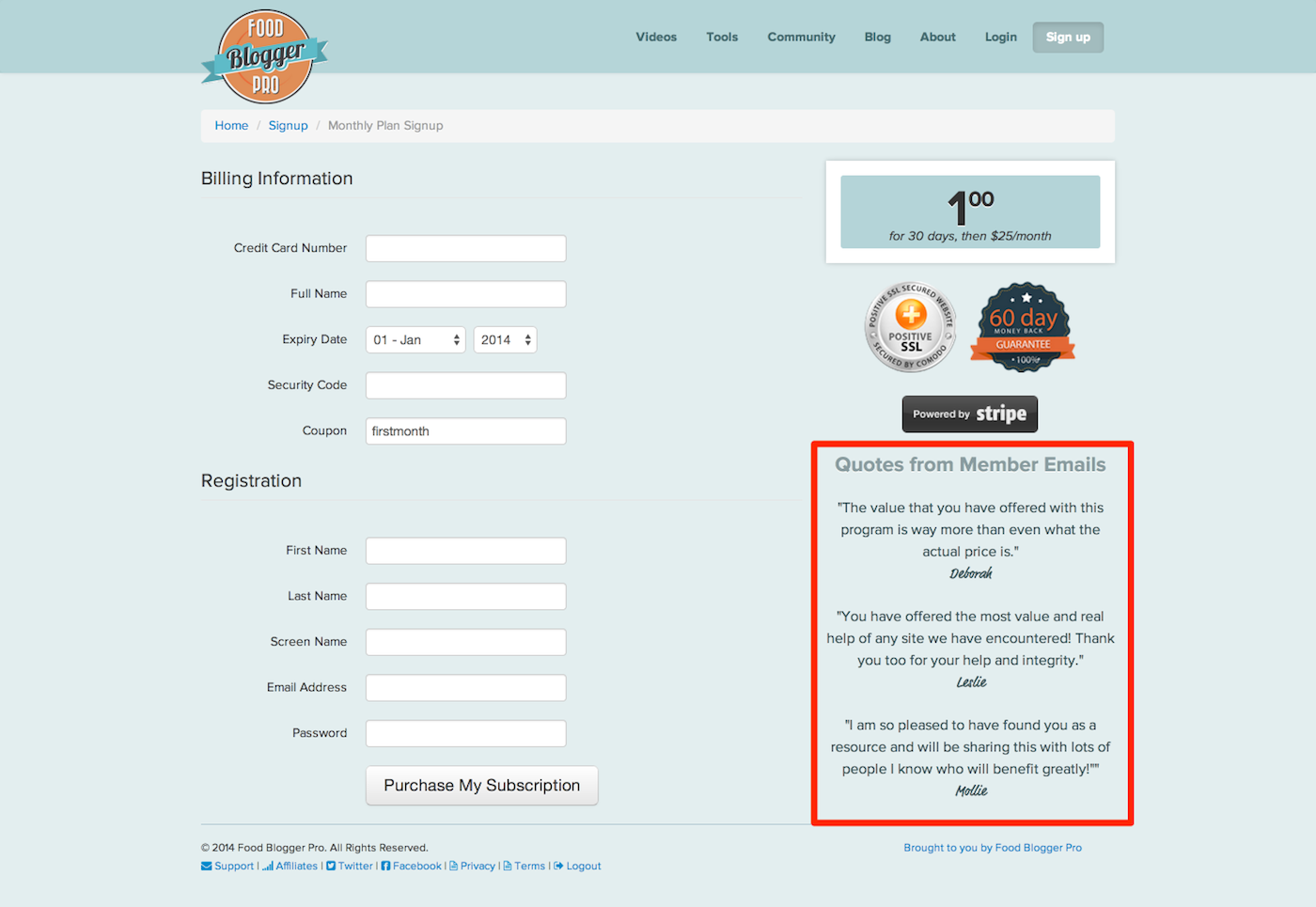
A clear call to action is good, but a clear call to action along with a testimonial is great.
4. Making it personal
In general, people want to work with people, not faceless businesses. The previous home page did a poor job of communicating exactly who was behind Food Blogger Pro.
By adding the “Our (short) story” section we were able to personalize Food Blogger Pro a bit.
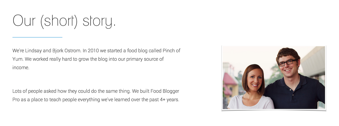
Do we love that picture? Nope. (I actually have sweaty armpits in it…thank goodness for dark shirts.)
Do we think having a photo of us will make the site more personal and therefore help people feel more comfortable about signing up for Food Blogger Pro? You bet.
The road to 2%
As mentioned in the first conversion rate post, our goal is to get the conversion rate for Food Blogger Pro up to 2%.
If you look back at that first post you’ll notice that our conversion rate was .98%, and with this test we had a conversion rate of .90%.
Wait…the overall conversion rate went down?
Yep.
But I thought you said the conversion rate went up?
Technically the conversion rate went down when compared to the last experiment, but it went up when compared to the original home page.
Here’s why that can happen:
Different seasons of the year result in different conversion rates. The conversion rates were higher when we did our first A/B test.
When we say that the conversion rate improved by 138% it means at the time we were testing the variation performed 138% better than the original.
The bad news? We didn’t get any closer to a 2% conversion rate. The good news? We had a successful A/B test where we improved the home page. We’ll use the things we learned to build a new variation and continue testing over, and over, and over…
The fun never ends! 🙂
What about you?
Does this stuff make sense? Do you think you’ll ever end up doing an A/B test for a product you’re selling on your blog? Do you think it’s worth it? I’d love to hear your thoughts, questions, and comments below or over in the FBP Community Forum.
This is super helpful info, Bjork! I also think it’s hilarious that you felt the need to share that you had sweaty armpits in the photo of you and Lindsay. 🙂 I definitely think I will do A/B testing, but it’s a bit early for me to think about it yet. I need more content and a product! Getting ready to start planning the outline for my first e-book. Exciting stuff! Thanks again for sharing this process and letting us come along for the ride.
TMI? 🙂
I love how intentional you’ve been about building your blog Beth. Starting on your eBook is another example of that. It’s inspiring! Keep up the good work.
Thanks for the great post. I love your site because you have a terrific knack for demystifying the world of social media and you so generously share your knowledge. Thank you for acting on “the abundance theory” (everyone can win)! I appreciate you.
Thanks for the kind words Wanda! Happy to hear that the site has been helpful.
I love the new landing page! It’s super clean and focused. Thank you for sharing your experience/numbers, Bjork. I’ll be bookmarking this for future use!
Thanks Bridgid! Makes me so happy to hear that!
Finally got around to reading some back posts. Super helpful post we have a lot of optimizing to do 🙂
Happy to hear it was helpful Dustin. We’re looking to do round 2 of A/B testing on the home page. There’s always something to do, huh? 🙂
Yea always stuff to do lol. What do you use for your A/B testing?
Google Analytics. Here’s a post I wrote about how we set it up: https://www.foodbloggerpro…
What did you use to perform the test, just google analytics bandit experiments?
Yep! That was it. 🙂 Two different pages and GA bandit.
Let me know if you have any other questions about it.